Open any trading app and the first thing you see is a wall of little red and green rectangles. That is a candlestick chart, and it is now the default way humans look at price almost everywhere on Earth. What most people never learn is that this chart has a backstory stranger than the markets it tracks: a Japanese rice exchange, a merchant who became a legend, a birthday nobody can actually prove, and a New York analyst who reintroduced the whole thing to the West barely thirty years ago.
This is the opening piece in a series on reading price. Before we get into what candles say, it is worth knowing where they came from, because the history quietly explains how the chart works and, just as usefully, teaches you to spot the difference between documented fact and trading folklore. That skill matters more than any single pattern.
Before the candle: how the West charted price
To appreciate why candlesticks were a leap, look at what traders had instead. In the West, charting grew up alongside the machinery of the market itself.
The big enabler was the stock ticker, invented in 1867 by Edward A. Calahan, which printed live transaction prices onto a ribbon of paper tape (History.com). For the first time, prices traveled beyond the trading floor in near real time. The skill of the era was "tape reading," interpreting the speed and sequence of prints to feel where the market was leaning. There was no picture, just a stream of numbers and an experienced eye.
Charts came next. By the 1880s, newspapers were routinely publishing daily high, low, and closing prices, and that high-low-close convention became standardized in the financial press over the following decades. Charles Dow, who co-founded what became Dow Jones & Company and The Wall Street Journal, built the first stock-market average in the 1880s and used his editorials to argue that markets move in trends marked by successive highs and lows (Connecticut History). After his death, those editorials were compiled by followers into what we now call Dow Theory, the bedrock of Western technical analysis.
Two visual formats came out of this world. The OHLC bar chart drew each period as a vertical line from low to high, with small ticks for the open and close, a compact way to show the same four numbers a candle uses. And point-and-figure charting, a system of stacked Xs and Os that ignores time entirely and plots only meaningful price moves, traces back to Dow's "book method" of recording prices around 1900. Its first dedicated book, Victor de Villiers's The Point and Figure Method of Anticipating Stock Price Movements, appeared in 1933 (Wikipedia).
So the West had price data, trend theory, and chart formats. What it did not have was the candle. That was developing on the other side of the world, in a market built entirely on rice.
Meanwhile in Japan: the Dojima rice market
In Osaka, rice was money. Feudal lords were paid in it, taxed in it, and needed to convert it to cash, and that created one of history's first true commodity markets at the Dojima Rice Exchange.
The pivotal date is 1730, when the Edo shogunate, under the eighth shogun Tokugawa Yoshimune, formally authorized both a spot market for trading rice bills and a rice futures market at Dojima (ODEX). Informal trading had run there since roughly the 1690s, but 1730 is the documented year the market became official. These "rice bills" were sophisticated instruments. They could cover rice not yet harvested, functioning as forward contracts, and futures positions were traded against a deposit called shikigin, an early form of margin (Dojima Rice Exchange, Wikipedia).
This matters because it is the real soil the candlestick grew from. Long before anyone drew a green box, Japanese rice traders were running a liquid, speculative, margined futures market and had every incentive to track price closely. Out of that environment comes the most famous name in candlestick lore.
The legend of Munehisa Homma
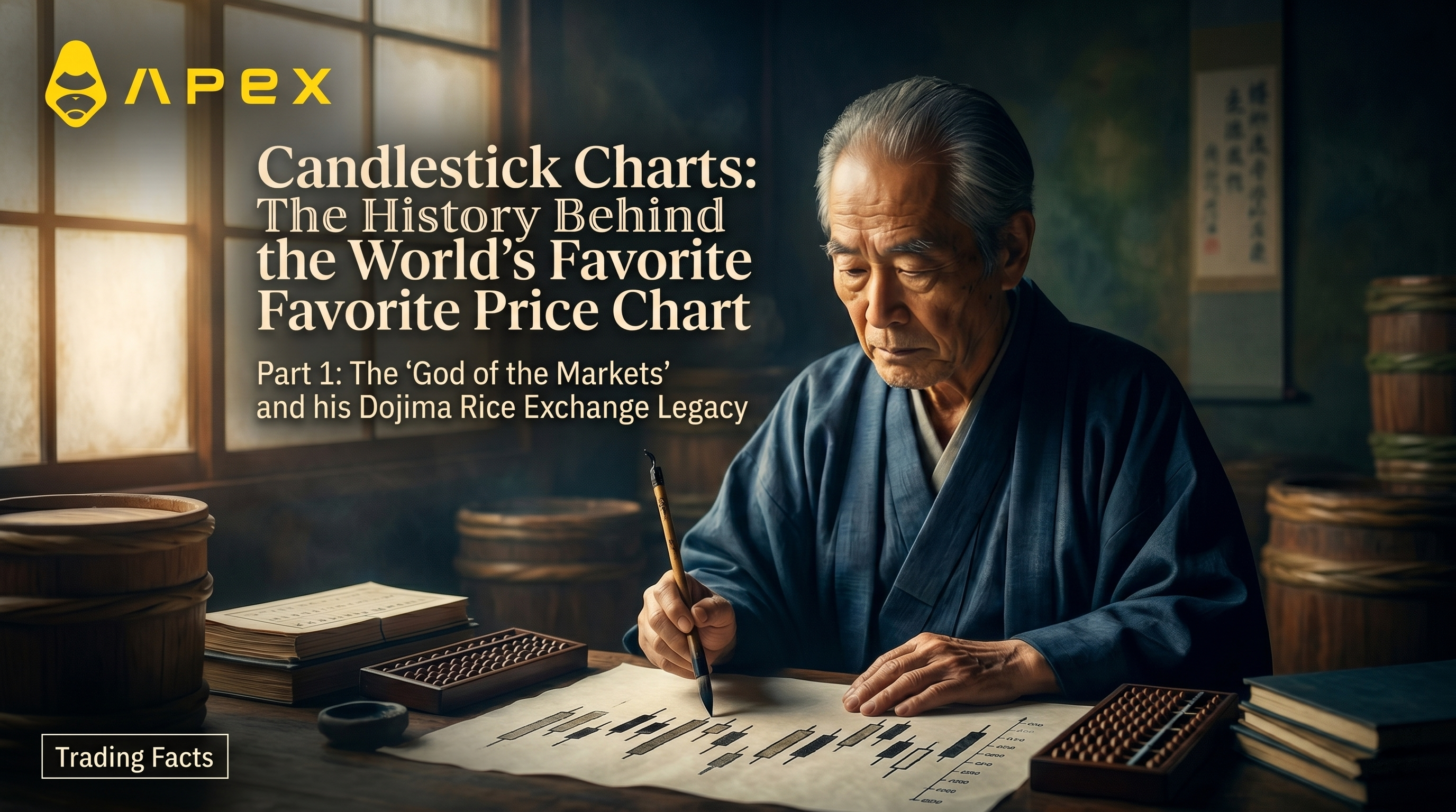
The story goes like this. In the 18th century, a rice trader named Munehisa Homma (also written Sokyu Honma) came out of the city of Sakata, mastered the psychology of the Dojima market, and made a fortune so vast he was called the "god of the markets." Along the way, the legend says, he invented the candlestick chart to visualize the open, high, low, and close of rice prices, and codified a set of trading principles known as the Sakata rules. He is, in countless blog posts and trading courses, simply "the father of candlestick charting."
It is a great story. Parts of it are even true. Homma was a real person, born in 1724 and dead in 1803, a genuine rice merchant from Sakata who traded at the Dojima exchange during the Tokugawa shogunate (Honma Munehisa, Wikipedia). The trouble starts when you ask for the part everyone repeats: that he invented the chart on your screen.
...and what the record actually says
Here the romance meets the evidence, and the evidence is thinner than the legend.
The claim that Homma created candlestick charts is best described as attribution, not documentation. Even reference sources that name him hedge, calling him someone who is sometimes considered the father of the chart rather than its confirmed inventor. The most authoritative modern voice on the subject pushes back harder. Steve Nison, the analyst who did more than anyone to bring candlesticks west and who researched their origins directly, has argued that it is unlikely Homma used candle charts at all, and that the visual candlestick as we know it more plausibly developed in the early Meiji period, the late 1800s, decades after Homma died (Candlestick chart, Wikipedia).
In other words, the chart may be a century younger than its supposed inventor. The popular "Sakata rules invented the candle around 1750" timeline does not hold up to verification, and at least one widely repeated dating claim, that candlesticks first appeared with Homma after 1850, collapses on inspection because it puts him in two centuries at once.
None of this erases Homma. He was a formidable trader whose writing on market psychology is real and influential. But the precise birthday of the candlestick chart is genuinely uncertain, and the confident "invented by Homma in the 1700s" line you will see everywhere is folklore wearing the costume of fact. Holding both ideas at once, honoring the figure while doubting the tidy origin story, is exactly the habit a good chart reader needs.
Anatomy of a candle
Whenever it was actually born, the design is brilliant, and it encodes the same four numbers the West was already publishing: the open, high, low, and close of a period (QuestDB).
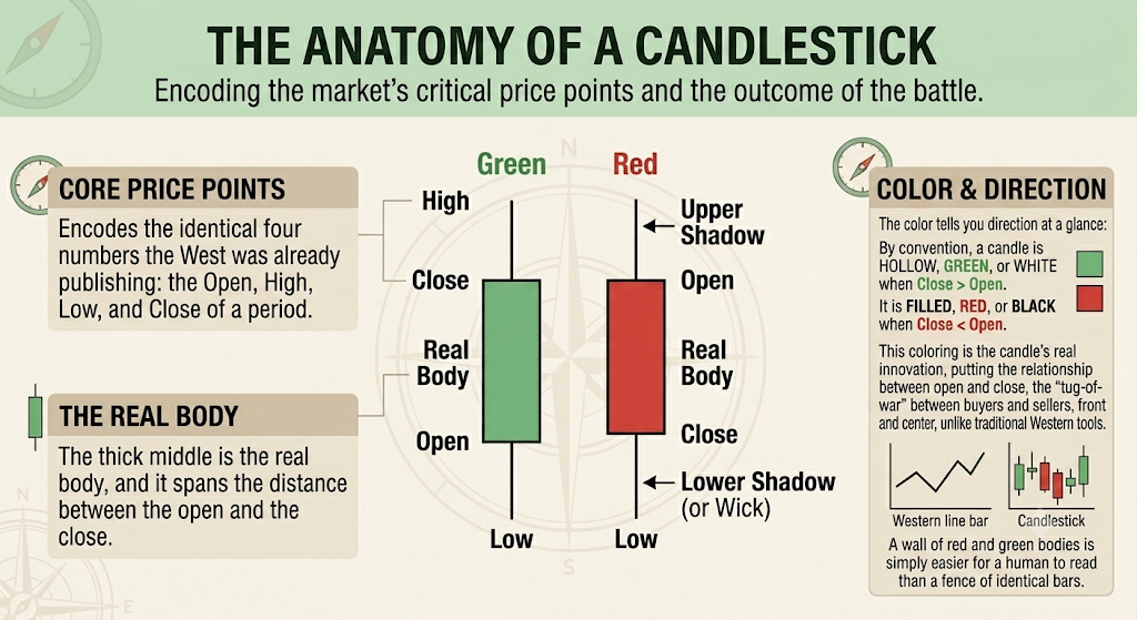
The thick middle is the real body, and it spans the distance between the open and the close. The thin lines poking out of the top and bottom are the wicks (also called shadows), and they reach to the high and the low (Cube.exchange). The color tells you direction at a glance: by convention a candle is hollow, green, or white when price closed above where it opened, and filled, red, or black when it closed below.
That coloring is the candle's real innovation over the Western bar chart. Both use the identical four data points, but the bar chart treats them evenly, while the candle fills the body and colors it, putting the relationship between open and close, the tug-of-war between buyers and sellers, front and center. As Nison has stressed, the Japanese place heavy emphasis on the opening and closing prices, whereas traditional Western tools really do not (Technical Analysis of Stocks & Commodities). A wall of red and green bodies is simply easier for a human to read than a fence of identical bars.
How candlesticks reached the West
For most of the 20th century, this entire tradition was invisible to Western traders, locked behind a language barrier. One person changed that.
Steve Nison, then an analyst at Merrill Lynch, encountered Japanese candlestick techniques and set about documenting them for an English-speaking audience. His first article on the candlestick formation appeared in December 1989 and set off a wave of interest. He followed it with the book that became the standard reference, Japanese Candlestick Charting Techniques, first published in 1991, and then with Beyond Candlesticks: New Japanese Charting Techniques Revealed in 1994 (Wiley/Amazon).
The timeline is worth sitting with. The chart that now dominates trading screens worldwide has been mainstream in the West for only about three decades. A format often described as ancient went global within living memory.
Beyond the standard candle: three variants worth knowing
Once the candle crossed over, so did a family of related Japanese chart types, each redesigned to answer a different question. Three are worth your time now.
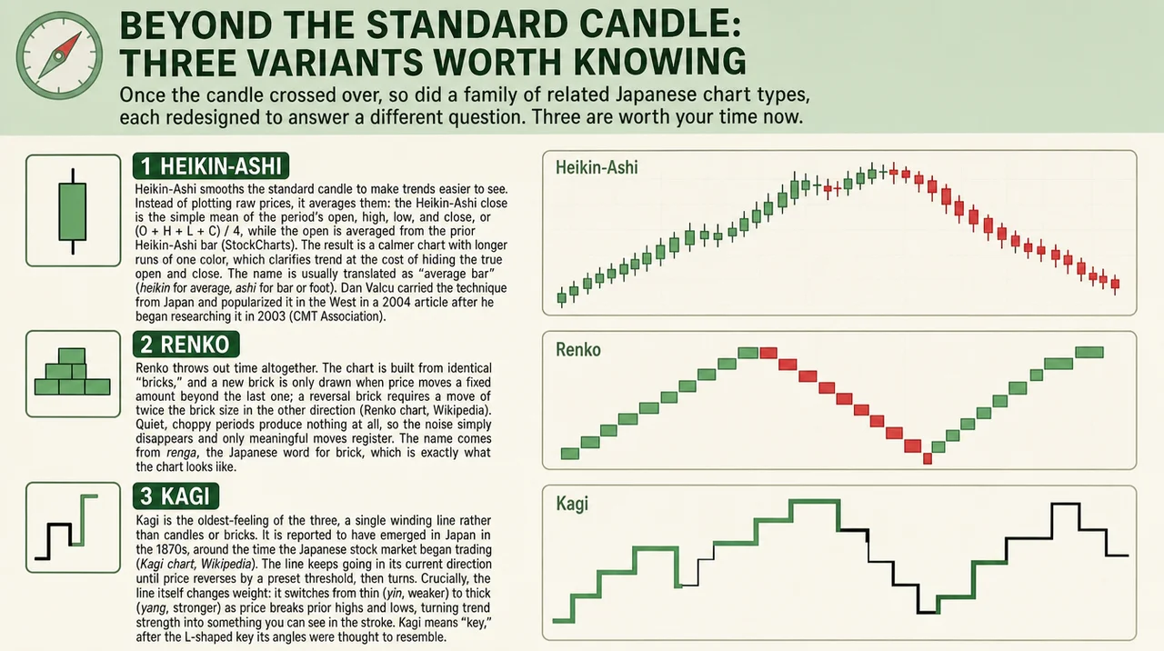
Heikin-Ashi smooths the standard candle to make trends easier to see. Instead of plotting raw prices, it averages them: the Heikin-Ashi close is the simple mean of the period's open, high, low, and close, or (O + H + L + C) / 4, while the open is averaged from the prior Heikin-Ashi bar (StockCharts). The result is a calmer chart with longer runs of one color, which clarifies trend at the cost of hiding the true open and close. The name is usually translated as "average bar" (*heikin* for average, ashi for bar or foot), though the exact gloss varies and the snappy "average pace" version does not really hold up. It was the trader Dan Valcu who carried the technique from Japan and popularized it in the West, in a 2004 article after he began researching it in 2003 (CMT Association).
Renko throws out time altogether. The chart is built from identical "bricks," and a new brick is only drawn when price moves a fixed amount beyond the last one; a reversal brick requires a move of twice the brick size in the other direction (Renko chart, Wikipedia). Quiet, choppy periods produce nothing at all, so the noise simply disappears and only meaningful moves register. The name comes from renga, the Japanese word for brick, which is exactly what the chart looks like.
Kagi is the oldest-feeling of the three, a single winding line rather than candles or bricks. It is reported to have emerged in Japan in the 1870s, around the time the Japanese stock market began trading (Kagi chart, Wikipedia). The line keeps going in its current direction until price reverses by a preset threshold, then turns. Crucially, the line itself changes weight: it switches from thin (*yin*, weaker) to thick (*yang*, stronger) as price breaks prior highs and lows, turning trend strength into something you can see in the stroke. Kagi means "key," after the L-shaped key its angles were thought to resemble.
Chart type | Axis | What it shows best | What it hides |
Standard candlestick | Time | Open, high, low, close every period | Nothing; it's the raw record |
Heikin-Ashi | Time | Trend direction and persistence | The true open and close |
Renko | Price (time-free) | Clean trend, filtered noise | Time, volume, minor wiggles |
Kagi | Price (reversal-based) | Trend strength via line weight | Fixed-interval detail |
These are not the whole family. You will also meet hollow candlesticks, which recolor candles by comparing each close to the prior one, and three-line break charts, another time-free Japanese format, both of which we will cover later in the series.
Why this history still matters
The candlestick chart is a Japanese answer to a universal problem, born in a rice market, mythologized around a real trader, and handed to the West by a single determined analyst only a generation ago. Knowing that arc does two things. It explains the design, because the color and the body exist to foreground the fight between buyers and sellers. And it inoculates you against the confident half-truths that fill trading education, starting with the tidy claim that one man invented this chart in the 1700s.
That second skill, separating the documented from the merely repeated, is the real foundation of this series. In the next installment we will leave the history behind and start reading the candles themselves: what a single bar is actually telling you, and where the signal ends and the story begins.
Explore more from this series: Part 1 | Part 2 | Part 3 (Coming Soon)
This article is for educational and informational purposes only and is not financial, investment, or legal advice. Do your own research and consult a licensed professional before investing.