
The head-and-shoulders is the most famous shape in trading. Three peaks, the middle one highest, and a line drawn under the dips: every course teaches it, and most will tell you it "works 80% of the time." It is the poster child for chart patterns, the big multi-bar shapes that are supposed to map the future of a price.
Here is what makes this installment different from the hype. Chart patterns are simultaneously the most over-promised and the most rigorously tested corner of technical analysis, and the verdict is genuinely split. One landmark study found they carry real information. Another found that the people trading the head-and-shoulders in US stocks lost money. And the trader who measured thousands of them by hand found the famous shape hits its target barely half the time. This piece teaches you the shapes and, honestly, what they are worth.
What a chart pattern is
A chart pattern is a multi-bar formation, a shape that takes weeks or months to draw, as opposed to the one-to-three-candle patterns from earlier in this series. StockCharts puts the relationship simply: "chart patterns are more complex versions of trend lines," so they are built from exactly the tools you already have, the trendlines, support, and resistance of Parts 4 and 5.
They come in two families. Reversal patterns mark a trend change, a top or a bottom. Continuation patterns mark a pause before the prior trend resumes (StockCharts). The skill is the same in both: a pattern is only a setup, not a signal, until price breaks out of it.
Watch a pattern work
Take the head-and-shoulders top, the classic reversal, and walk through it.
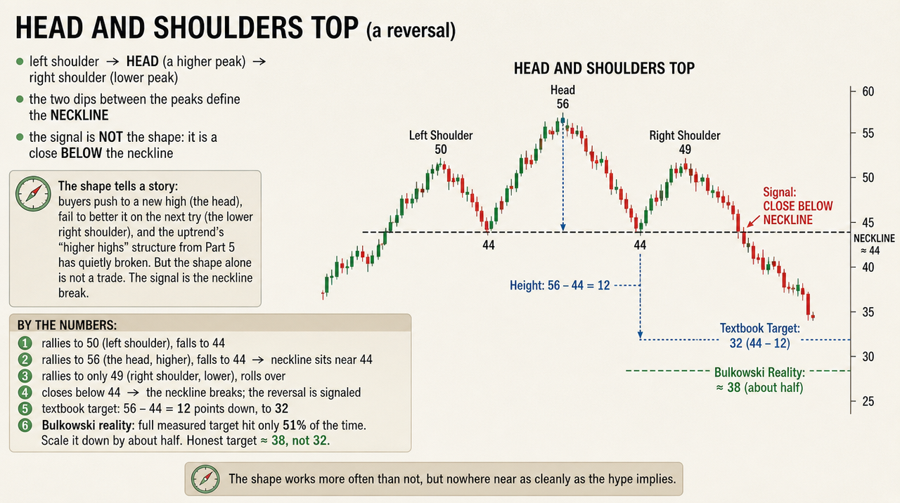
The shape tells a story: buyers push to a new high (the head), fail to better it on the next try (the lower right shoulder), and the uptrend's "higher highs" structure from Part 5 has quietly broken. But the shape alone is not a trade. The signal is the neckline break. By the numbers:
That last line is where folklore and evidence collide. The textbook says measure the head-to-neckline height and project it down for your target, so 12 points to 32. But Thomas Bulkowski, who measured thousands of these by hand, found the head-and-shoulders top reaches its full measured target only 51% of the time, so he scales the projection down by about half (Bulkowski). The honest target is closer to 38 than 32. The shape works more often than not, but nowhere near as cleanly as the hype implies.
The famous shapes, briefly
Head-and-shoulders top and bottom. The top is the reversal above; the inverse (bottom) is its mirror, a bullish reversal where the head is the lowest low. The bottom tests better in Bulkowski's data than the top does (more on that below).
Double top (M) and double bottom (W). Price tests a level twice and fails twice, then breaks the other way. A double top is two failed pushes into the same resistance; a double bottom, two tests that hold the same support. Both are reversal patterns built on a single Part 4 level the market kept testing and could not get past.
Triangles. Two converging trendlines: ascending (flat top, rising lows), descending (flat bottom, falling highs), and symmetrical (both converging). Taught as continuation or, for the slanted ones, directional. Hold that thought, because the descending triangle has a surprise.
Flags and pennants. A short, tight consolidation after a sharp move, the market catching its breath before, usually, continuing. Continuation patterns by reputation.
Do they actually work?
This is the heart of it, and the answer is the most interesting in the series because the evidence genuinely splits three ways.
Bulkowski's reality check. His Encyclopedia of Chart Patterns puts tested numbers on shapes that usually travel on reputation, and they deflate the folklore. The head-and-shoulders top fails to go anywhere 19% of the time and, as we saw, hits its full target only 51% of the time. The inverse bottom is genuinely better, failing just 11% of the time with a 45% average rise after the breakout (Bulkowski). And the pattern that best punctures the hype is the descending triangle: taught everywhere as bearish, it actually breaks upward about 53% of the time in his data (Bulkowski). A shape's reputation and its tested behavior are not the same thing. (Fair warning: these are idealized "perfect trade" measurements on historical data, not what a real trader nets after costs, and Bulkowski notes the edges have shrunk over the decades.)
The academic split. Two serious studies reached opposite-feeling conclusions. Lo, Mamaysky and Wang built an algorithm to detect patterns automatically across US stocks from 1962 to 1996 and concluded that "several technical indicators do provide incremental information and may have some practical value" (Lo, Mamaysky & Wang, 2000). Note the careful word: information, not profit. In the other corner, Carol Osler tested head-and-shoulders trading in US equities and found it flatly unprofitable, concluding that the people trading it qualify as "noise traders" whose price impact fades within two weeks (Osler, FRBNY 1998). Both can be true: a pattern can carry statistical information and still not hand a retail trader a profit after costs and slippage.
The throwback problem. Even a clean breakout often does not run straight. Bulkowski found that since 2000, about 58% of patterns throw back to the breakout level before continuing, and when a throwback cuts back below the breakout price, the eventual move is markedly weaker (Bulkowski). Volume is the usual tell, the same lesson as Part 6: by convention, conviction-heavy breakouts on rising volume hold better than quiet ones, though that remains a rule of thumb.
So the honest verdict: chart patterns carry real, measurable information, their tested success rates sit far below the "works 80-90%" folklore, they are only meaningful on a confirmed breakout, and whether they actually pay depends on the market and your costs.
Reputation versus evidence
Pattern or claim | What traders are taught | What the tested data shows |
Head-and-shoulders top | A near-certain reversal, "works ~80%" | 19% fail to move; only ~51% reach the measured target |
Inverse head-and-shoulders | A reliable bottom | Stronger: ~11% fail, ~45% average rise, but still idealized |
Descending triangle | Bearish, breaks down | Breaks UP about 53% of the time |
Patterns in general | A map of the future | Modest information value (Lo-Mamaysky-Wang); unprofitable for H&S traders in US equities (Osler) |
Trading a pattern without getting burned
Three habits turn a shape from a hope into a plan:
Wait for the breakout close. The pattern is a setup; a close beyond the neckline or trendline is the trigger. Anticipating it is the surest way to get trapped when the shape fails.
Demand confirmation. A breakout on rising volume that does not immediately throw back below the breakout price is the kind that tends to hold. The quiet ones deserve suspicion, exactly the Part 6 lesson.
Put your line in the sand inside the pattern. A head-and-shoulders that breaks down has no business climbing back above the right shoulder; a triangle break that slips back inside the triangle has failed. That gives you a clean, structural place to admit you are wrong, and to size the trade for the roughly one-in-five that fails outright.
Common mistakes
Seeing patterns everywhere. The human eye finds faces in clouds and head-and-shoulders in noise. If you have to squint, it is not there.
Trading before the breakout. The shape is a setup; the breakout is the signal. Anticipating it is how you get caught when the pattern fails, which a fifth of the time it does.
Believing the reliability myth. "Works 80% of the time" almost never cites a tested source. The real failure rates, and the fact that even winners often miss the full target, are the honest baseline.
Forcing the fit. A descending triangle that breaks up was never the bearish setup you wanted. Trade the breakout you get, not the pattern you hoped for.
The bottom line
Chart patterns are the famous shapes the whole market can see, which is exactly why they matter and exactly why they disappoint. They are built from the trendlines and levels you already know, they genuinely carry some information, and their tested success rates are real but far humbler than the courses claim. Read them as setups that need a confirmed breakout, size for the real failure rate, and never trade a shape you had to squint to find.
That completes the toolkit. Across this series you have the candle, the multi-candle pattern, the level, the trend, the volume behind a move, and now the big shapes they combine into. In the finale we stop adding tools and put them together: how a trend, a level, a candle, and confirmation stack into a single read, and how to manage the risk when, inevitably, the read is wrong.
Explore more from this series: Part 1 | Part 2 | Part 3 | Part 4 | Part 5 (Coming Soon)
This article is for educational and informational purposes only and is not financial, investment, or legal advice. Do your own research and consult a licensed professional before investing.