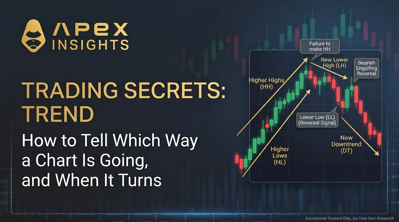
Open any chart and, before you read a single candle, your eye answers one question on its own: which way is this thing going? That answer is the trend, and it is the frame every signal in this series has quietly sat inside. A hammer and a hanging man are the same candle, sorted only by the trend they appear in. Every reversal pattern was defined as forming "after a downtrend" or "in an uptrend." Support and resistance are where trends pause. We have been leaning on trend the whole time. Now we read it directly.
The honest twist, and the reason this fits the series: the idea behind trend, that price tends to keep moving the way it has been, is one of the best-documented effects in all of finance. But the popular tool for drawing it, the hand-drawn trendline, is subjective and barely testable. That is the exact mirror of last installment's Fibonacci result, where the tool looked scientific and the phenomenon was empty. Here the phenomenon is strong and the tool is soft.
What a trend actually is
A trend is not a mood. It is a structure you read off the swing highs and swing lows, the peaks and troughs price leaves behind. The definition comes straight from Dow Theory: "An uptrend is defined by prices that form a series of rising peaks and rising troughs (higher highs and higher lows). In contrast, a downtrend is defined by prices that form a series of declining peaks and declining troughs (lower highs and lower lows)" (StockCharts).
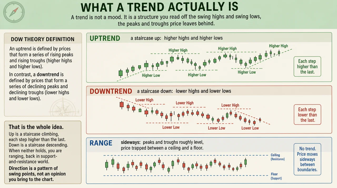
That is the whole idea. Up is a staircase climbing, each step higher than the last. Down is a staircase descending. When neither holds, you are ranging, back in last part's support-and-resistance world. Direction is a pattern of swing points, not an opinion you bring to the chart.
Read a trend, then watch it break
Definitions are slippery until you put numbers on them, so let us walk through one. Here is an uptrend, by the numbers, where every high tops the last high and every low sits above the last low:
 AN UPTREND, step by step:
   low 100  →  high 110  →  low 105  →  high 118  →  low 112  →  high 125
   highs climbing:  110 < 118 < 125     lows climbing:  100 < 105 < 112
   every step higher than the one before  =  a healthy uptrend
Nothing mystical: the lows go 100, 105, 112 and the highs go 110, 118, 125, both marching up. As long as that holds, the trend is "assumed valid until proved otherwise," in Dow Theory's words. So what proves it otherwise? The staircase failing. Watch the same chart roll over:
 THE BREAK:
   from high 125, the next rally stops at 121   ← a LOWER high (first warning)
   then price slides down to 111                ← below the prior low of 112,
                                                  so a LOWER low
   lower high + lower low  =  the uptrend is over
That is the entire trend-change signal: an uptrend ends when price fails to make a new high (121 could not top 125) and then breaks the prior higher low (111 is under 112). This is the exact moment every reversal pattern from the multi-candle installment was trying to catch. A bullish engulfing or a morning star matters because it might mark that turning low. The candle is the hint; the broken structure is the proof.
One more wrinkle: there is never just one trend. Dow Theory describes three running at once, a primary trend lasting "a few months to many years," a secondary trend of "a few weeks to a few months," and daily fluctuations of hours to days. They routinely disagree. A day trader's downtrend can be a rounding error inside an investor's multi-year climb, so before you call anything a trend, decide which clock you are reading.
Trendlines: paying off a debt
Last installment listed trendlines as a kind of support and resistance, then deferred them. Here is the payoff. A trendline turns that staircase into one diagonal line. Draw a line under the rising lows of an uptrend and it acts as moving support: "Uptrend lines act as support and indicate that net demand is increasing even as the price rises" (StockCharts). Draw one across the falling highs of a downtrend and it acts as moving resistance.
The rule that keeps you honest: "It takes two points to draw a trend line, and the third one confirms the validity." Any two points define a line; the third touch is what tells you the line means something. Add a parallel line on the far side and you have a channel, a rough envelope the trend has been respecting.
Now the caveat, because it is the whole point of this section. Where you anchor a trendline is subjective. Hand two traders the same chart and they connect different wicks and bodies, and a line can always be nudged until it "works." That is why clean tests of hand-drawn trendlines barely exist. The structure underneath, those higher highs and higher lows with their hard numbers, is objective. The line you sketch over it is interpretation, so hold it loosely.
Putting the trend to work
Knowing the trend is not trivia; it changes what you do. Two habits follow straight from the structure:
Trade with the staircase, not against it. In an uptrend, the signals worth taking are the ones pointing up: a hammer at a higher low, a bounce off an up trendline. That same hammer in a downtrend is fighting the current, which is the grain of truth in "the trend is your friend."
Let the structure tell you when you are wrong. An uptrend's last higher low is a line in the sand. While price holds above it, your read is intact. A decisive close below it, the drop under 112 in our walkthrough, is the market saying the staircase has broken. That gives you a clean, unemotional place to admit the trend has changed instead of arguing with the chart.
This is also the bridge to everything still ahead. A candle is a hint, a level is a place, and the trend is the direction that tells you which hints and places to trust.
Is the trend real?
Here trend earns its keep, because the thing underneath it has serious evidence, the kind almost no chart pattern can claim.
The effect is called momentum, and two landmark studies pinned it down. Jegadeesh and Titman showed that buying recent winner stocks and selling recent losers produced "significant positive returns over 3- to 12-month holding periods" (Jegadeesh & Titman, 1993). Moskowitz, Ooi and Pedersen then showed an asset's own past 12-month return predicted its next move in every one of the 58 futures markets they tested, across stocks, bonds, currencies, and commodities, over 25-plus years (Moskowitz, Ooi & Pedersen, 2012). They literally named it the "trend" effect. So "the trend is your friend" is, unusually, backed by data.
But a friend that turns on you is the honest part. Momentum suffers rare, brutal crashes. In July and August of 1932, the very stocks momentum was shorting, the past losers, returned 232% while the past winners gained just 32%; over March to May of 2009, losers rose 163% to winners' 8% (Daniel & Moskowitz, 2016). Years of edge can vanish in weeks.
And the tools are softer than the phenomenon. Brock, Lakonishok and LeBaron found simple moving-average rules beat chance on the Dow from 1897 to 1986 (Brock, Lakonishok & LeBaron, 1992), but when Sullivan, Timmermann and White re-ran the test across roughly 8,000 rule variations, the edge shrank once they corrected for how many rules had been tried (Sullivan, Timmermann & White, 1999). Test enough lines and some look brilliant by luck, which is exactly what you do when you redraw a trendline until it fits. The lesson: the research backs momentum as a broad statistical force, not the specific line on your screen.
The whole section in one view, reputation against evidence:
Concept | What traders are taught | What the evidence shows |
Market structure (HH/HL) | The objective definition of a trend | Sound and standard; the honest core |
Momentum ("the trend is your friend") | A reliable tailwind | Real and robust, but crash-prone and debated |
Trendline as support/resistance | A precise line price obeys | Useful guide; placement is subjective and barely tested |
A trendline break | A clean buy or sell trigger | Fragile; the edge shrinks after data-snooping correction |
Common mistakes
Drawing the line to fit your hope. Redraw a trendline five times until it touches where you want and you have charted your bias, not the market. Anchor it to obvious swing points and leave it.
Fighting a strong trend. Counter-trend trades can work, but betting against a documented tendency is the harder game, which is the grain of truth in the slogan.
Ignoring the timeframe. A 5-minute downtrend says nothing about the daily. Always know which clock you are on.
Treating the slogan as a system. Momentum is an edge with violent crashes, not a guarantee. Size your trades as if the trend can fail, because sometimes it fails fast.
The bottom line
Read the structure first. Higher highs and higher lows is an uptrend; the mirror is a downtrend; neither is a range. The trend breaks the moment price fails to make a new high and then takes out the prior low, the exact turn every candlestick reversal is hunting for. The direction behind it is backed by some of the strongest evidence in finance, and undercut by sharp crashes and the wobbliness of the lines we draw to trade it.
Once you can see direction, every candle and level you have learned clicks into place against it. Next we add the one gauge this part kept leaning on and the earlier parts kept invoking without explaining: volume, the measure of whether the crowd actually showed up for the move.
Explore more from this series: Part 1 | Part 2 | Part 3 | Part 4 | Part 5 (Coming Soon)
This article is for educational and informational purposes only and is not financial, investment, or legal advice. Do your own research and consult a licensed professional before investing.